Introduction
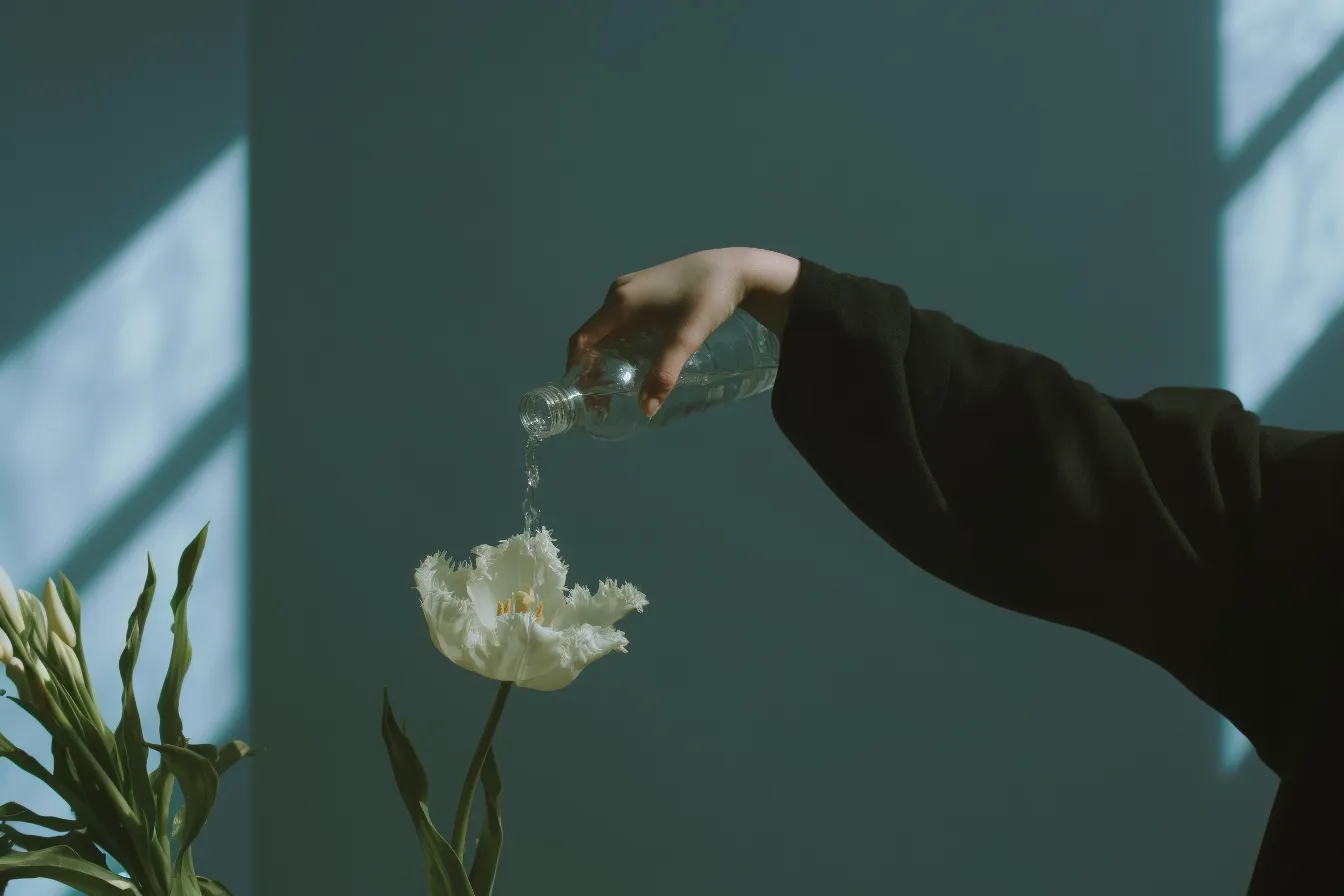
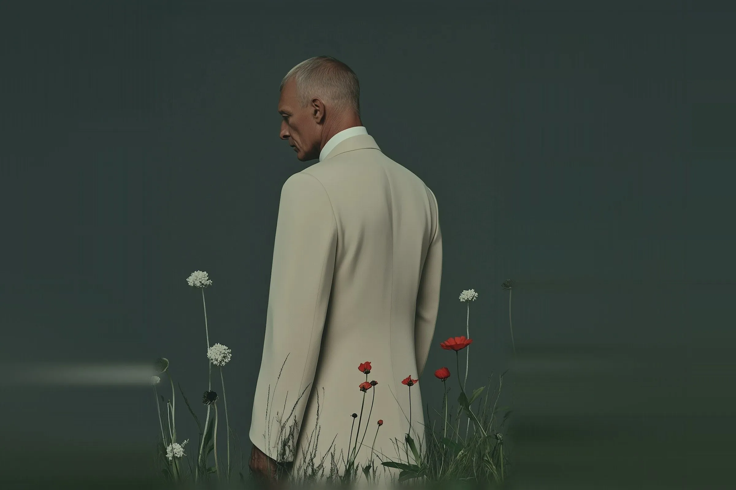
The brands we remember usually hold two things at once: polish and grit, quiet and loud. This is how we look for that tension and keep it.
Content
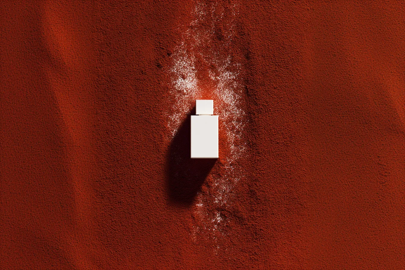
Start with the material. A linen texture, a rough stone, a hand-cut edge: real surfaces give a refined layout something to push against.
- Pair one raw element with one controlled one.
- Let photography carry the wildness, and type carry the order.
- Leave room. Contrast needs space to read.
Done well, the result feels expensive without feeling cold, and natural without feeling unfinished.